This page describes guidelines related to manipulating the assets from the front of pack to form the digital pack.
On this page:

Omitting and resizing assets
When designing the digital pack, it is strongly encouraged that suppliers amplify everything on the front of pack that communicates the 4W’s and omit everything else. Note that this extends beyond text and logos to colour and imagery, which can play an important part in communicating brand or variety.
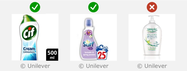
In the image on the right, both the brand name and product name have been enlarged, and non-4W information (‘hot and fiery’, nutrition data) has been omitted.

Amplify 4Ws and omit non-4Ws.
Adding visual elements
Any visual elements (text or graphics) that are added into the digital pack should convey one or more of the 4Ws, and should exist elsewhere on the physical pack.
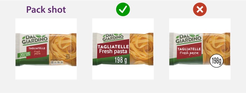
The pack shot on the left does not contain any size information. In the middle image, size has been added as plain text, which is compliant. In the right image, a white circle has been added, which does not exist anywhere else on the physical pack, so this is not compliant. Image reproduced from GS1 guideline.
Repositioning assets
Front pack assets may be rearranged into any position. However, assets should be kept in roughly the same relative positions as on the physical pack because changing the relative positions is likely to impair recognisability.

Assets should be kept in roughly the same relative positions as on the physical pack.
Ensuring text has sufficient contrast
Any text that communicates the 4Ws needs to have sufficient contrast difference between the colour of the text and its background. The best method for checking this is the Accessible Perceptual Contrast Algorithm for Lightness contrast (APCA).
This freely available tool can be used to calculate Lightness contrast, using an eyedropper to select the foreground and background colours from an image.
The Lightness contrast can also be evaluated using the Photoshop and PowerPoint versions of Clari-Fi.
The Lightness contrast is reported as a number between 0 and 108.
For text in e-commerce images:
- Lightness contrast greater than 60 = PASS.
- Lightness contrast values between 45 and 60 = BORDERLINE
- Lightness contrast less than 45 = FAIL.
The APCA Lightness contrast is recommended instead of the contrast ratio that appears in the Web Content Accessibility Guidelines (2.2), because the contrast ratio overestimates the contrast of black text on coloured backgrounds, and underestimates the contrast for white text on coloured backgrounds. These different methods for calculating contrast are discussed further in the article titled Does the contrast ratio actually predict the legibility of text.

Any text that communicates the 4Ws should have an APCA Lightness contrast greater than 60.
Avoiding text keylines
Text effects like key lines and drop shadows should not be used, they add visual noise to the image, reduce the visual clarity, and make text harder to read.
If the text does not have sufficient contrast against its background, then improving the choice of colours is a much better solution than adding a keyline around the text.
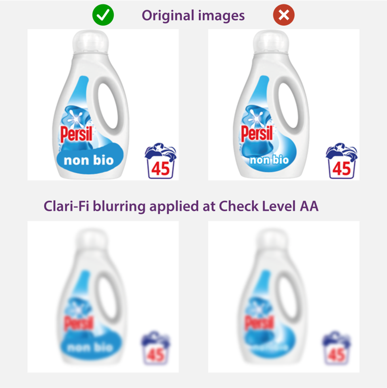
The left hand side images have the words 'non-bio' in white text on a blue background, which passes the visual clarity test. The right-hand side images have the same text with a pale blue keyline against a pale background colour, which fails the test.
Displaying white packs
If a pack is white, it is encouraged to represent this in the digital pack using an off-white colour (RGB 253,253, 253), together with a key line. This helps to define the edges of the product and makes it visible against the white background of the retailer’s site.
Using a slight off-white colour to represent white packs helps the product stand out against a white screen.
Making pack edges obvious
Adding key lines to products with pale colours is encouraged to assist recognition of their shape.
However, drop shadows and reflections should not be added, as they add visual noise without helping the shopper and break GS1 and Google rules.
When stacking multiple packs on top of each other within a bundle layout, the edges of each pack should be graphically highlighted, in order to help the shopper interpret the image more quickly and easily. This can be achieved either via a key line or a Gaussian blur.
Adding key lines to white products is encouraged to assist recognition of their shape. However, drop shadows and reflections should not be added.
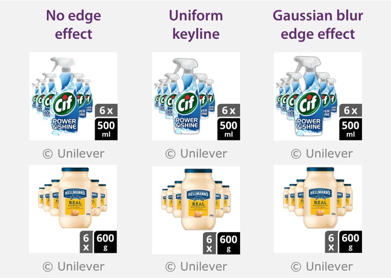
When stacking multiple packs on top of each other within a bundle layout, the edges of each pack should be graphically highlighted.
Feedback
We would welcome your feedback on this page:
Privacy policy. If your feedback comments warrant follow-up communication, we will send you an email using the details you have provided. Feedback comments are anonymized and then stored on our file server. If you select the option to receive or contribute to the news bulletin, we will store your name and email address on our file server for the purposes of managing your subscription. You can unsubscribe and have your details deleted at any time, by using our Unsubscribe form. If you select the option to receive an activation code, we will store your name and email address on our fileserver indefinitely. This information will only be used to contact you for the specific purpose that you have indicated; it will not be shared. We use this personal information with your consent, which you can withdraw at any time.
Read more about how we use your personal data. Any e-mails that are sent or received are stored on our mail server for up to 24 months.
Unless otherwise stated, all images are © Unilever and used with permission. Walkers is a trademark owned and designed by PepsiCo and used with permission.