Bundle layouts may be used when one image tile is used to represent the sale of multiple packs, but these packs are not necessarily held together by any packaging when they are delivered. The layouts that are shown opposite have been created for this situation:
Similar to the other kinds of hero image layouts, front-pack images within bundle layouts should be manipulated to amplify the communication of the 4Ws and omit unnecessary details (see Manipulating the front of pack for further information).
Examples of bundle layouts.
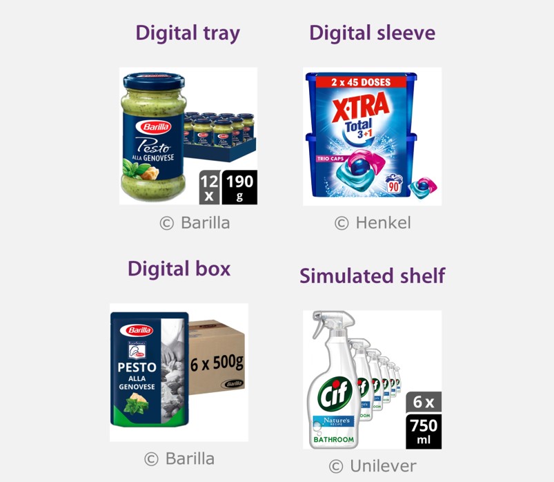
Digital tray
This layout shows the packs together with a digitally created cardboard tray. The tray does not necessarily exist, but provides a visually pleasing way of binding multiple packs together within a single image. However, digital trays should be plain, rectangular and minimal in height - they should not be used to incorporate more brand logos or marketing claims.
For 2-3 packs in a tray, the front most pack in the tray is usually large enough such that the 4Ws can pass the visual clarity test. For 6-12 packs in the tray, each individual pack becomes unavoidably small, so one of the packs is shown in front of the tray on the left-hand side of the image, and the tray is shown slightly behind it on the right-hand side of the image. The situation for 4 packs depends on the specific product, so 4 packs may use either variant of digital trays.
Therefore, some guidelines apply to all trays, whereas some only apply to 4-12 packs in the tray, and others to 2-4 packs in a tray. Each of these are now described in turn.
The following guidelines apply to all digital trays
- Digital trays should use a single flat colour, which should be a tint/shade of the dominant brand colour that’s on the pack, or a plain cardboard colour. The colour chosen should contrast with the outer edges of the packs that it contains, so that the eye can distinguish the tray edges and the products inside.
- Digital trays should be minimal in height, and should not significantly obscure the products that are in the tray.
- The tray should be arranged so that its depth direction points from bottom-left to top-right. This ensures that the product in front does not hinder the shopper determining the number of rows of products that are in the tray.
- The number of packs shown in the tray should exactly match the number of packs that are being sold.
If the tray contains 4-12 packs
- A single product should be shown at the biggest possible size, on the left-hand side of the image.
- The tray should be positioned on the right-hand side of the image.
- The single pack may slightly overlap the tray, however enough of the tray should be visible to get a sense of the number of packs that are in it.
- A Gaussian blurring edge effect should be applied to the front image to help make the pack edges obvious.
- Even if the packs contain discrete items, these should not be shown outside of the packs.
- The product shown in front may be slightly zoomed, so that the bottom of the product is not shown. However, in this case, the products that are shown in the tray should have the correct aspect ratio.
- The packs in the tray may be digitally manipulated so that they match the front image, or they may be pack shots.
- The camera angle of the tray should be roughly consistent with the camera angle of the product that shown in front. If the product in front is shown with a completely flat camera angle, then the tray should be shown slightly rotated, with a slightly elevated camera angle.
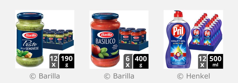
- The tray should be accompanied by a double set of lozenges that describes the number of packs and the size of each pack, if the retailer will accept these. See Communicating the number of packs for detailed guidance on these lozenges.
Alternatively, if the retailer will not accept the lozenges for trays that contain 4-12 packs
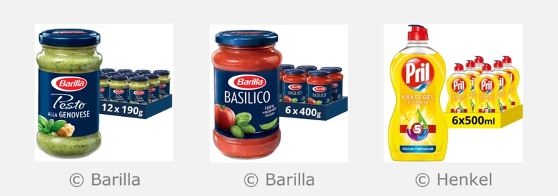
- A single line of text should be digitally added into the tray, and this line of text should only describe the number of packs and the size of each pack, using only numerals and standard units.
- Best attempt should be made to maximise the size of the text, while also keeping the tray minimal in height, so that it does not obscure the products that are in the tray. An ideal text size would be 340px (within a 3000 x 3000 pixel image).
- The typeface should be Open Sans Bold, and the text height and weight should be uniform across all the numerals.
- If text is added into the tray, then it should be white, unless the tray is a very pale colour, in which case it should be black.
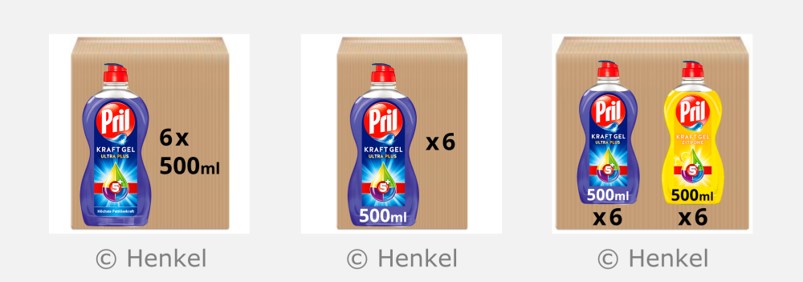
- The tray may be shown in three-quarter angle, which helps to communicate the total number of the items in the tray (as shown in the Barilla example below). Alternatively, the tray may be shown such that one side is front and flat, which helps make the text on the tray easier to read the text (as shown in the Pril example below).
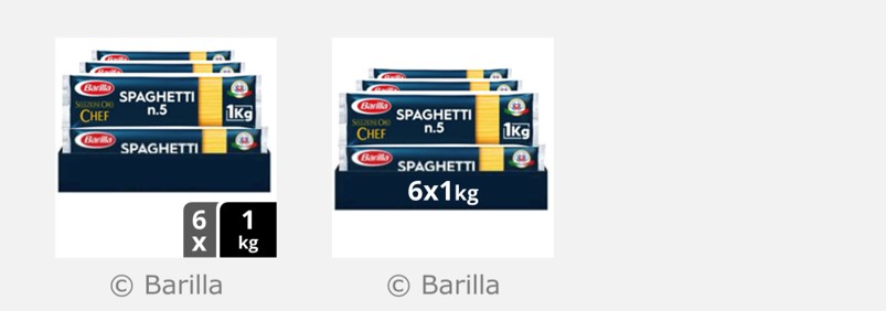
If digital trays are used for landscape packs
The packs in the tray may be arranged in a double layer, as shown in the example below (which shows the alternatives both with and without the lozenges)
If the tray contains 2-4 packs
- All of the packs should be shown in a tray, without pulling one pack out of the tray.
- If the packs contain discrete items, and the image doesn’t contain any lozenges, and the items inside the packs are all the same, then exactly one of the discrete items may be shown outside of the tray, in the bottom right-hand corner. If the pack contains several different kinds of items, then exactly one of each different kind of item may be shown outside of the tray.
- In order to help communicate the number of packs and the size of each pack a single line of text may be digitally added into the tray. The guidelines for this text are the same as digital trays with 4-12 packs, and compliant examples are shown in the images below
- Alternatively, the image may include a double set of lozenges. The guidelines for these lozenges are the same as digital trays with 4-12 packs, and compliant examples are shown in the images below.
Digital sleeve
In this layout, the packs are shown partially enclosed in a digitally created sleeve. The sleeve doesn’t necessarily exist, but can be created using the graphics that exist on the actual packs.
Compared to other kinds of bundle layouts, digital sleeves have the advantage that the pack graphics are only presented once, at a much bigger size. Furthermore, the packs are only partially obscured by the sleeve, so the shopper still gets a visual indication of the number of packs.
The following guidelines apply to digital sleeves:
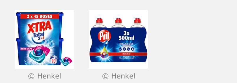
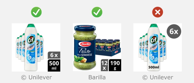
- Digital sleeves should only contain graphics that exist on the actual packs, but should also describe the size of each pack and the number of packs. In order to satisfy both of these requirements, a neutral description of the quantity may be added into the digital sleeve, like ‘2 x 45 washes’ or ‘Twin Pack’. Phrases like ‘Mega pack or ‘Best value pack’ should not be included.
- For landscape packs, digital sleeves should be plain and rectangular (as shown in the XTRA example below).
- For portrait packs, sleeves should either be plain and rectangular, or wrap exactly to the shape of the packs (as shown in the Pril example below).
- For sleeves that enclose several multipacks, if the multipack is homogeneous, then exactly one lowest-level item may be shown outside of the sleeve. If the multipack is not homogeneous, then exactly one of each different kind of item may be shown outside of the sleeve.
- Sleeves may be used for gift packs or variety packs, where different items are enclosed within a single sleeve. In this case, the graphics of the sleeve should communicate the 4Ws for the packs that are enclosed, using a combination of the graphics that exist on the actual packs.
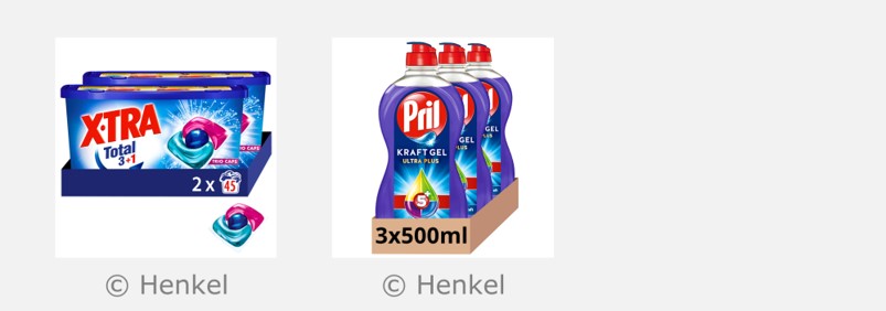
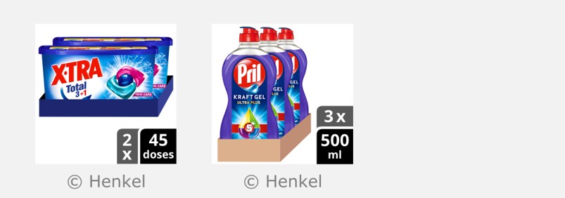
Digital box
This layout shows the pack together with a digitally created cardboard box. The box does not necessarily exist, but showing the box in the image communicates that the price refers to multiple packs, and the text that is digitally added into the cardboard box communicates exactly how many packs.
Digital boxes should be a pale cardboard like colour, and should be arranged so that the depth direction points from bottom left to top right (for consistency with digital trays).
When using this layout, a single pack may be shown separately, in addition to the box. Alternatively, the cardboard box can be shown on its own, with the image of the pack digitally added onto one of the surfaces of the cardboard box. Each of these cases are now considered in turn.
If the single pack is shown separately, in addition to the box
- The single pack should be shown at the biggest possible size, on the left-hand side of the image tile.
- The box should be positioned on the right-hand side.
- The box should be arranged so that its depth direction points from bottom left to top right.
- The single pack may overlap in front of the box, in order to help pass the visual clarity test.
- Black ink should be added into the cardboard box in order to communicate the number of packs and the size of each pack. The use of Open Sans bold is encouraged, and the numerals should be at least as big as 340px Open Sans bold (within a 3000 x 3000 pixel image). This ensures that size information will pass the visual clarity test.
- The black ink may also depict brand assets, but should not compete with the product for visual attention. Any ink on the box should only be black.
If an image of the pack is digitally added into one of the surfaces of the cardboard box
- The box should be arranged so that the front appears flat, and the top of the box is visible, as shown below.
- The size of each pack should ideally be communicated within the pack artwork
- Black ink should be added into the cardboard box in order to communicate the number of packs. The text should be positioned either below, or to the right-hand side of the pack image. The use of Open Sans bold is encouraged, and the numerals should be at least as big as 340px Open Sans bold (within a 3000 x 3000 pixel image).
- If the cardboard box contains packs that are all the same, then exactly one image of the pack should be shown. If the box contains several different packs, then exactly one of each different kind of pack should be shown.
If the cardboard box contains packs that are all the same, then the ‘size of each pack’ may be positioned on the box (like the left image), or on the pack (like the centre image). If the box contains several different packs, then it usually works better to position the size on the pack (like the right image).
Simulated shelf
This layout shows all of the packs that are being sold, together with off-pack lozenges that describe the number of packs and the size of each pack.
The packs should be arranged in a perspective view, so that they look like they are sitting on a shelf, with one larger pack at the front, pulled forward from the rest. The number of packs that are shown in the image should exactly match the number that are available for sale.
When using a simulated shelf layout, the lozenges that display the ‘number of packs’ and ‘size of each pack’ should always exist, and should be positioned as a vertical stack, or a horizontal stack, as shown opposite.
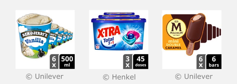
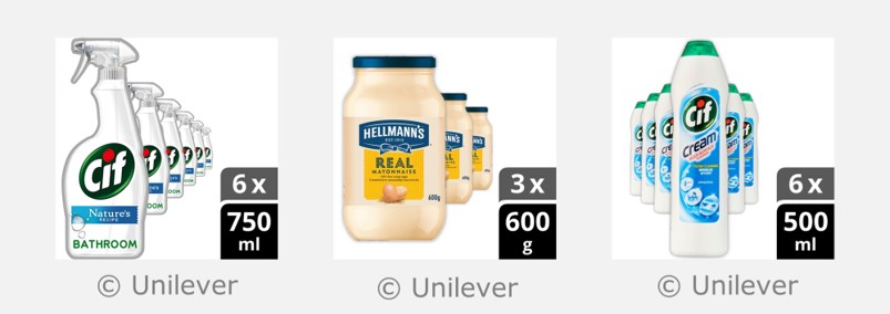
- For packs that are portrait, the visual clarity of the front pack is usually maximised when the lozenges are arranged as a vertical stack in the bottom right-hand corner, as shown in the cif and Hellmann’s examples opposite.
- For packs that are closer to square, or landscape, the lozenges are better arranged as a horizontal stack in the bottom right-hand corner, as shown in the Ben & Jerry’s, XTRA and Magnum examples opposite.
The following panels give further guidelines for simulated shelf layouts:

Examples of the ‘Simulated shelf’ layout with a vertical stack of lozenges.
Examples of the ‘Simulated shelf’ layout with a horizontal stack of lozenges.
Communicating the number of packs
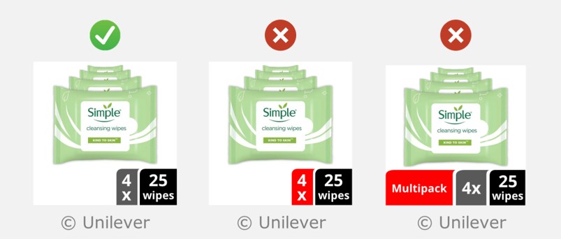
When using the Digital tray or Simulated shelf layouts, the lozenges should be the standard shapes shown opposite, in either of the standard positions shown opposite. Floating lozenges should not be used under any circumstances.
Lozenges that communicate both ‘the number of packs’ and the ‘size of each pack’ should always be included. Bundle layouts should not depict a single pack on its own
The lozenge for the number of packs should be dark grey (RGB 89,89,89). A lozenge containing the text ‘multipack’ is unnecessary, and should not be included.
In order to guarantee perfect consistency in the visual appearance of off-pack size lozenges, suppliers and retailers are encouraged to produce these using Automated methods.
Furthermore, the page on Presenting size information gives more detailed guidance for off-pack size lozenges.
Rationale
If the lozenge that communicate the size of each pack is presented on its own, without the accompanying lozenge that describes the number of packs, it becomes ambiguous as to whether the lozenge is communicating the size of each pack, or the total amount of product that is being sold.
If the size of the pack is displayed on the front of the pack, one could argue that a single lozenge in the bottom right-hand corner could be used to display the total number of packs. However, the text that communicate the size on the front of the pack is unlikely to pass the visual clarity test, either because the pack is too tall and thin to start with, or because the packs within a bundle image have to be shown at a reduced size in order to fit them all in.
If lozenges are used to communicate both the number of packs, and the size of each pack, one could argue that it is sufficient to accompany these lozenges with a picture of just one of the packs. However, this would mean that the images for 3, 6 and 12 packs would look almost identical, with only the number in the lozenge changing each time, which would likely be confusing for shoppers.
The shape and position of lozenges should be like either of these compliant examples. Floating lozenges should not be used.
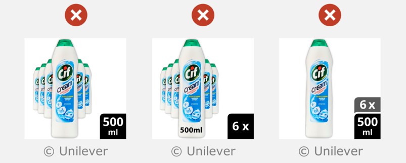
Lozenges that communicate both ‘the number of packs’ and the ‘size of each pack’ should always be included. Bundle layouts should not depict a single pack on its own.
The lozenge that communicates the number of packs should be dark grey (RGB 89,89,89). A lozenge containing the text ‘multipack’ is unnecessary, and should not be included.
Positioning the packs in a perspective view
The packs shown in the image should be arranged in a perspective view, like as though they are sitting on the shelf, with one a larger pack at the front, pulled forward from the rest.
For most packs with a portrait aspect ratio, the visual clarity is maximised when the first product is shown on the left hand side, and the products fade into the distance towards the right-hand side of the image (as shown in the cif trigger spray and Hellmann’s examples opposite). Alternatively though, the first pack may be shown in the centre, with the remaining packs fading into the distance on either side of it (as shown in the cif cream cleaner example opposite).
For packs with a landscape aspect ratio, the packs should be arranged directly behind each other, as shown in the Simple and Zwitsal examples opposite.
For portrait packs, visual clarity is usually maximised when the packs are positioned like the trigger spray and mayonnaise examples. However, the packs may also be positioned like the cream cleaner example.
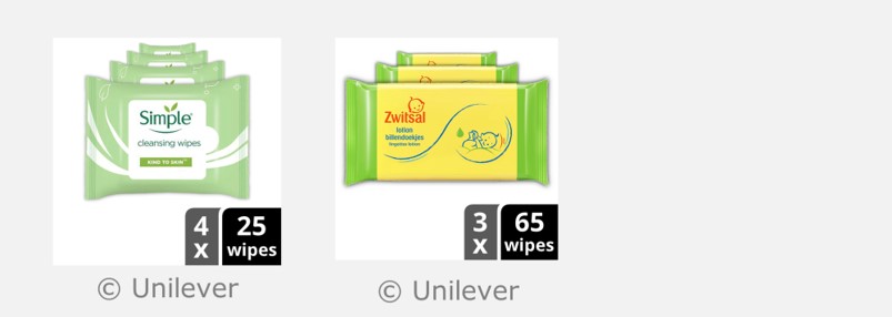
For landscape packs, the pack should be positioned one behind the other, like these examples.
Scaling guidelines for the packs at the back
The pack that’s in front should be shown as big as it can be. The height of the next pack should be scaled by about 60% (as shown opposite). After that, the height of each subsequent pack should be about 80-90% of the pack that’s in front. Each pack that is behind something should be positioned so that about 40% of the width is visible (or less). All of the packs should be vertically centred with respect to each other.
Scaling and positioning the packs in this way is done automatically when Clari-Fi is used to create simulated shelf layouts.
The packs should not all be shown at the same size, as this makes the details on the packs harder to see, and repetitive images are visually stressful, which means looking at them can cause headaches or discomfort. The perspective view is much more visually pleasing and communicates the details on the front of the pack more effectively.
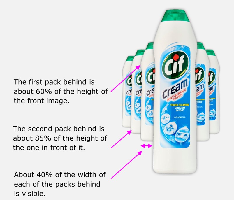
Demonstration of how the packs should be scaled and positioned.
Horizontal and vertical alignment
There are two possible options for the positioning of the bundle of packs in relation to the lozenges:
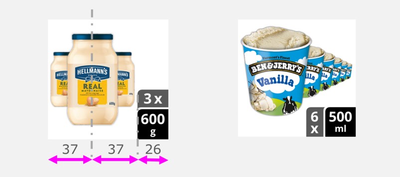
- For packs that are very tall and thin, or for small numbers of packs, the space within the image is best utilised by positioning the lozenges in a vertical stack, as shown in the Hellmanns example opposite. In this case, the bundle of packs is horizontally positioned so that the centre line of the bundle is 37% from the left-hand edge and 63% from the right-hand edge, so that the overall image looks horizontally balanced.
- For packs that are closer to square, or for larger numbers of packs, the space within the image is best utilised by positioning the lozenges in a horizontal stack, as shown in the Ben and Jerry’s example opposite. In this case, the packs are positioned so that the image as a whole looks vertically balanced.
The positioning of the packs in relation to the lozenges is done automatically when Clari-Fi is used to create simulated shelf layouts.
The image overall should look vertically and horizontally balanced, which requires different strategies depending on the position of the lozenges.
Making pack edges obvious
When stacking multiple packs on top of each other in a single image, the edges of each pack should be graphically highlighted, in order to help the shopper interpret the image more quickly and easily. This can be achieved by a keyline, or a Gaussian blur edge effect, as shown in the examples opposite. Whichever method is used, the edge highlighting needs to be prominent enough to help the shopper distinguish the packs from each other, yet subtle enough so as not to overpower the image.
In many cases, the difference between a suitably designed ‘Uniform keyline’ and ‘Gaussian blur edge effect’ is almost indistinguishable. However, using the ‘Gaussian blur edge effect’ is encouraged, because it’s generally better at achieving its functional purpose, while still remaining subtle and visually pleasing. The difference becomes more obvious when the image is viewed at a larger size.
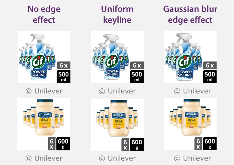
Examples of edge effects that can be applied to help shoppers interpret the image more quickly and easily.
Using Clari-Fi to create simulated shelf layouts
When manually produced by a graphic designer, bundle layouts can be time-consuming to produce, and equally time-consuming to modify. The extended version of Clari-Fi can produce these layouts almost instantly, and this tool will automatically set the positioning and scaling of the products to optimise the use of the available space within the square image tile.
Additionally, for any bundle layout, Clari-Fi can be used to automatically add the size lozenges into the image. See the page about using automated methods for more detail.
Please contact edc-toolkit@eng.cam.ac.uk if you are interested in this functionality.
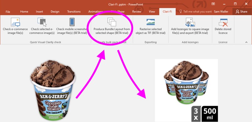
The extended version of Clari-Fi adds a button to the toolbar in PowerPoint, which automatically produces bundle images
Feedback
We would welcome your feedback on this page:
Privacy policy. If your feedback comments warrant follow-up communication, we will send you an email using the details you have provided. Feedback comments are anonymized and then stored on our file server. If you select the option to receive or contribute to the news bulletin, we will store your name and email address on our file server for the purposes of managing your subscription. You can unsubscribe and have your details deleted at any time, by using our Unsubscribe form. If you select the option to receive an activation code, we will store your name and email address on our fileserver indefinitely. This information will only be used to contact you for the specific purpose that you have indicated; it will not be shared. We use this personal information with your consent, which you can withdraw at any time.
Read more about how we use your personal data. Any e-mails that are sent or received are stored on our mail server for up to 24 months.
Unless otherwise stated, all images are © Unilever and used with permission. Walkers is a trademark owned and designed by PepsiCo and used with permission.