Secondary images are usually displayed within a carousel on the Product Detail Page, and may communicate product details, nutrition, ingredients, disposal instructions, benefit claims, brand claims, or show images of the product in use. This page introduces the different possible types of secondary images, and then gives guidelines for recommended size and contrast for text and icons in images in secondary images.
On this page
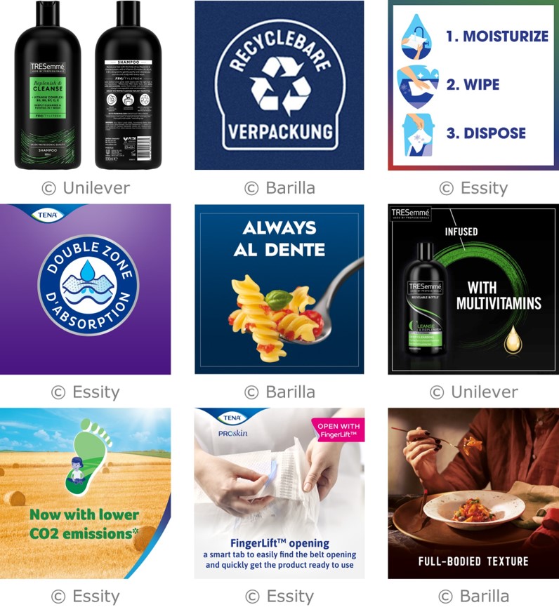
Examples of mobile-ready secondary images.
Introduction
Many of the guidelines for primary images are necessary to ensure a consistent look and feel when images from competing brands are displayed on product listing pages. However, secondary images from competing brands will never appear on the same page together, so the same restrictions do not apply. For example, text may be positioned off pack, brand assets may break the edges of pack, and bars and strips may be used.
Secondary images should not contain multiple languages, as this would make the text to small to pass the guideline for recommended size. Shoppers should only be shown images in their preferred language, and this should be arranged by the retailer.
In order to be considered mobile-ready, secondary images should pass the recommended guidelines for size and contrast of text and icons.
Secondary images usually appear on the Product Detail Page. One image is usually shown at a large size, within an interface that allows the user to quickly scroll through the set of images. Images © Unilever.
Recommended order for secondary images
The recommended order of secondary images is:
- Front of pack mobile ready hero image
- Photorealistic pack
- Amplified pack details (Product details, nutrition, ingredients, disposal instructions)
- Other kinds of secondary images
- If the back of pack is not embedded within the 'photorealistic pack' image, then the back of pack should be included as the last image.
Retailers typically mandate that photorealistic images of the front and back of pack exist somewhere within the set of secondary images.
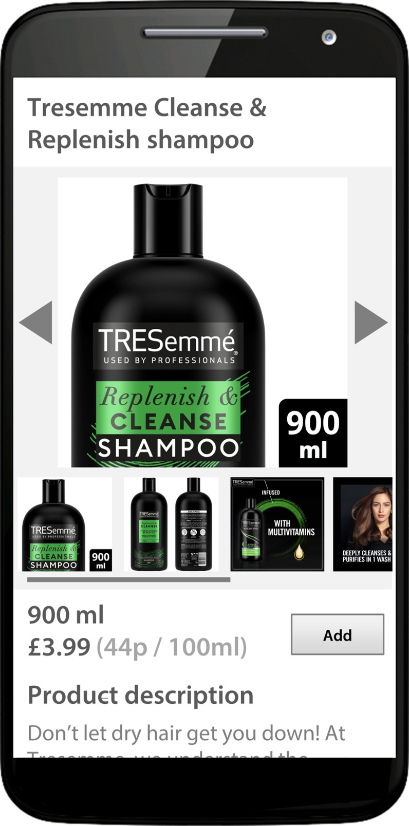
At the time of writing in February 2023, Amazon would display a maximum of 6 secondary images on mobile devices, or 5 plus a video, although other retailers may accept more images.
In this example, the first three images are used to show the mobile ready hero image, the photorealistic front and back of pack, and amplified pack details.
The last three images are used to communicate benefit claims. In this example, the back of pack was included together with the front of pack image, otherwise the back of pack would have been the last image in the set. Images © Unilever.
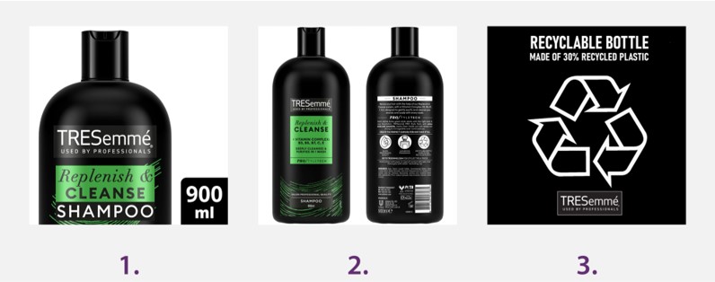
Photorealistic pack shots
The purpose of the Mobile Ready Hero Image is to communicate the 4Ws within a tiny image on a Product Listing Page. To achieve this, it is likely that the front of pack will need to be manipulated, the aspect ratio might be distorted, the product might be zoomed, and some of the elements might be omitted, repositioned, or resized. Furthermore, it is not usually possible to simultaneously show the 4Ws together with a reasonable depiction of the depth of the product.
So, the purpose of the photorealistic pack shot is to complement the Hero image, by showing the actual product that the consumer will receive. The photorealistic image may be drawn digitally or captured with photography, but elements should not be omitted or resized, because this would contradict the purpose of a photorealistic secondary image. The photorealistic pack shot should only contain items the consumer will actually receive.
Depending on the aspect ratio of the product, the three-dimensional shape may be communicated by:
- A single three-quarter angle pack shot.
- Front of pack and back of pack, shown side-by-side in a single image, each shot with a minimal degree of elevation.
The pack should be shown with the minimum possible degree of white space around the edges. This particular secondary image should not contain any off-pack claims, and should only show things that the consumer actually receives.
For multipacks, the outer layer of packaging should be shown. The item(s) inside may also be shown within the same image, or as a separate image.
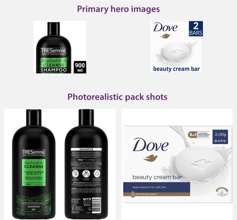
In order to communicate the 4Ws within the primary hero image, the pack might be stretched or zoomed, and some elements might be omitted or resized. The photorealistic pack shot complements this by showing the actual product that the consumer will receive. Images © Unilever.
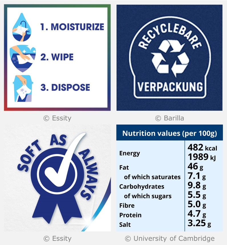
Amplified pack details
These images zoom in on a particular detail that is present on the actual physical pack, like recycling information, opening instructions, or usage instructions. The graphical styling of these images should be consistent with their appearance on the actual physical pack, but may be repositioned or resized to maximise the utilisation of the square canvas for a secondary image.
Text and icons within amplified pack details secondary images should pass the recommended levels of size and contrast, which are described further down this page. If the colour scheme of the physical pack means that the amplified details would not reach these recommended levels of contrast, then the colours in the secondary image will need to be tweaked to ensure that they pass.
Although the nutritional information and list of ingredients will be presented elsewhere on the Product Detail Page, suppliers may additionally choose to present these using secondary images, although the text will almost certainly need to be resized and reflowed in order to pass the recommended guidelines for size.
Examples of amplified pack details
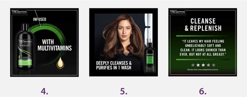
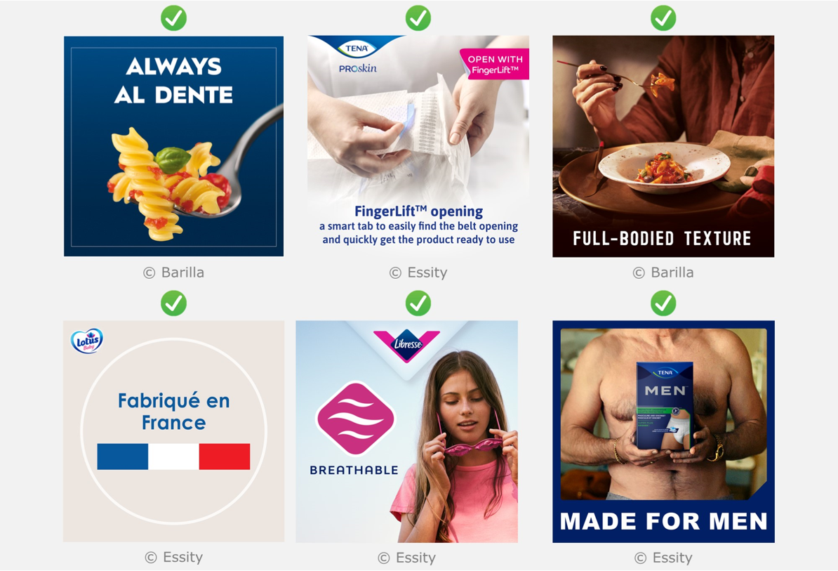
Other kinds of secondary images
Other possible kinds of secondary images include:
- Product benefit claims
- Brand claims
- Lifestyle images that show the product in use
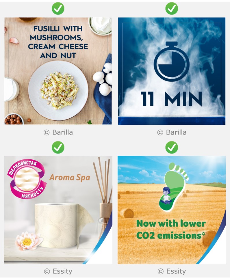
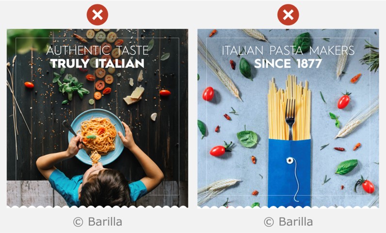
For all of these purposes, images should contain one single message. Otherwise it is likely that the text and icons will be too small to pass the guideline for recommended size.
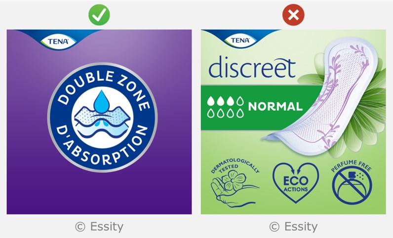
The example shown on the left contains one single message, and passes the guideline for recommended size of text and icons. The example on the right contains lots of different messages, and the details within the text and icons are too small to pass this guideline.
The background behind the text or icons within secondary images should be clean and homogeneous. There are a variety of techniques for including text within secondary images, which are listed here from best to worst.
- Flat colour behind the text (best)
- Minor variations in colour behind the text
- Excessive noise behind the text (worst)
Each of these will now be described in turn
Flat colour behind the text
The background behind any text should ideally be a single flat colour, like in the examples shown below.
Minor variations in colour behind the text
These include situations where the text is positioned over minor gradients (vignette), subtle pattern detailing, or a reasonably clean area of photograph, as shown in the examples below.
Excessive noise behind the text
Noisy backgrounds occur when there are multiple shapes and colours behind the text, as shown in the examples below. This makes the text harder to read and is strongly discouraged.
Size of text and icons in secondary images
The Clari-Fi tool should be used to ensure that text and icons within secondary images are presented at a big enough size. Clari-Fi enables the text and icons to be evaluated on a large screen device, and uses blurring to simulate the challenges of viewing these features on a mobile device.
In order to be considered mobile-ready, text and icons should remain easy to see when Clari-Fi Check Level AAA blurring is applied, assuming an image size of 30 x 30 mm.
Clari-Fi is calibrated to population data, so if the text and icons pass Check Level AAA, then the percentage of people that might have difficulty perceiving these details is 0-28%*. The Introduction to assessing e-commerce images page of the Clari-Fi website includes more detail on this calibration to population data.
PowerPoint and Photoshop versions of Clari-Fi are also available
Text and icons within Photorealistic pack shots are not required to pass the Clari-Fi clarity check, because this text is considered incidental.
* Population percentages refer to people who might have difficulty because of visual acuity issues. Some people may have difficulty perceiving these details for other reasons, especially colourblindness.
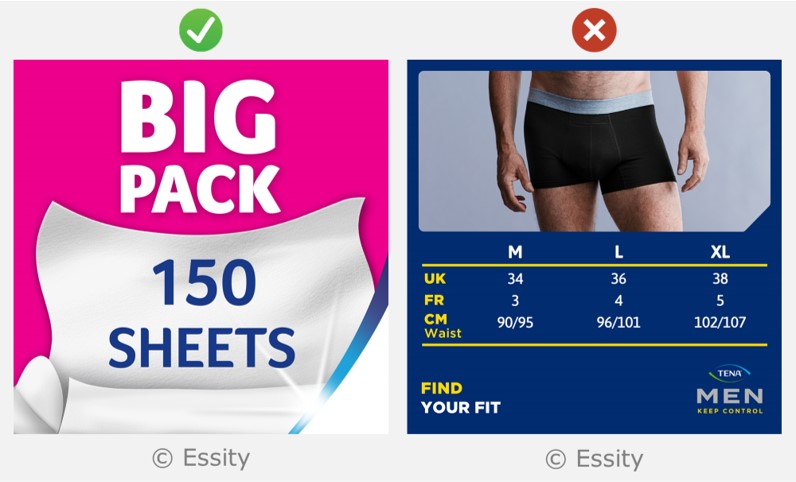
The text within the left-hand image is big enough for a secondary image. The text in the right-hand image is not.
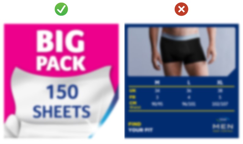
When the Clari-Fi tool is used to apply blurring at Check Level AAA, the text in the left-hand image remains easy to read, but the text in the right-hand image becomes impossible to read.
Contrast of text and icons in secondary images
Text and icons within Photorealistic pack shots are not required to pass the minimum level of contrast (because this text is considered incidental). However, minimum contrast thresholds apply to text and icons within secondary images.
The Accessible Perceptual Contrast Algorithm (APCA) is recommended for calculating the contrast of coloured text on a coloured background. This algorithm reports the Lightness contrast (Lc) as a number between 0 and 105.
The Lightness contrast (Lc) of text and icons within secondary images should be greater than 45.
The threshold of 45 is chosen because this approximately represents the letter charts that are associated with the population data that Clari-Fi is calibrated to.
The APCA algorithm is recommended over the Web Content Accessibility Guidelines (WCAG) contrast formula, because it better predicts the legibility of text on digital displays, and especially for white text on coloured backgrounds. An article by Sam Waller gives more detail on this topic.
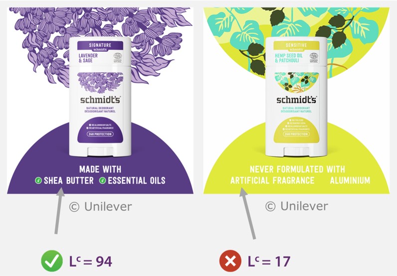
For text and icons within secondary images, the Lightness contrast (Lc) reported by the Accessible Perceptual Contrast Algorithm (APCA) should be greater than 45.
Feedback
We would welcome your feedback on this page:
Privacy policy. If your feedback comments warrant follow-up communication, we will send you an email using the details you have provided. Feedback comments are anonymized and then stored on our file server. If you select the option to receive or contribute to the news bulletin, we will store your name and email address on our file server for the purposes of managing your subscription. You can unsubscribe and have your details deleted at any time, by using our Unsubscribe form. If you select the option to receive an activation code, we will store your name and email address on our fileserver indefinitely. This information will only be used to contact you for the specific purpose that you have indicated; it will not be shared. We use this personal information with your consent, which you can withdraw at any time.
Read more about how we use your personal data. Any e-mails that are sent or received are stored on our mail server for up to 24 months.
Unless otherwise stated, all images are © Unilever and used with permission. Walkers is a trademark owned and designed by PepsiCo and used with permission.