This page describes guidelines related to presenting size information within the image tile.
On this page:

Positioning off-pack size lozenges
Off-pack size lozenges may be used to communicate size information (HoW much of it is there?). If used, these lozenges should be positioned in the bottom right corner. This maintains consistency across the images, so that the shopper knows where to look for the information. The bottom right of the image is the only location that is compatible with both portrait and landscape pack shapes.
For laundry products that contain discrete items, the pack may be shown with an item pull-out in the top right hand corner, but size should still be positioned in the bottom right corner.
For bundle packs, lozenges should be positioned in the bottom right corner, and arranged in a vertical or horizontal stack, as shown opposite.
In order to guarantee perfect consistency in the visual appearance of off-pack size lozenges, suppliers and retailers are encouraged to produce these using automated methods.
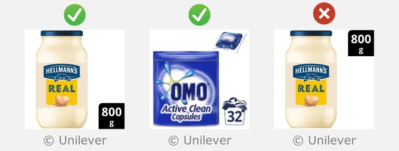
Off-pack size lozenges should be positioned in the bottom right corner.
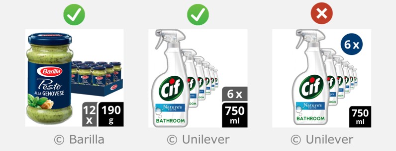
For bundle packs, lozenges should be positioned in the bottom right corner, and arranged in a vertical or horizontal stack. Floating roundels should not be used.
Describing size as a number of ‘functional uses’
Some products have an agreed category standard where size is commonly described as a number of ‘functional uses’ e.g. 4 serves, 30 washes. In other cases, a pack contains countable items, e.g. 40 cups, 20 wipes, 10 rolls.
In these cases, suppliers are encouraged to describe size in this way. The unit of size (e.g. serves, cups) should be included, except for laundry, where there is a category standard icon indicating ‘washes’ (see example on the right). In addition, the corresponding SI units (e.g. ml, grams) should be presented by the retailer in a complementary manner, such as in the product title.
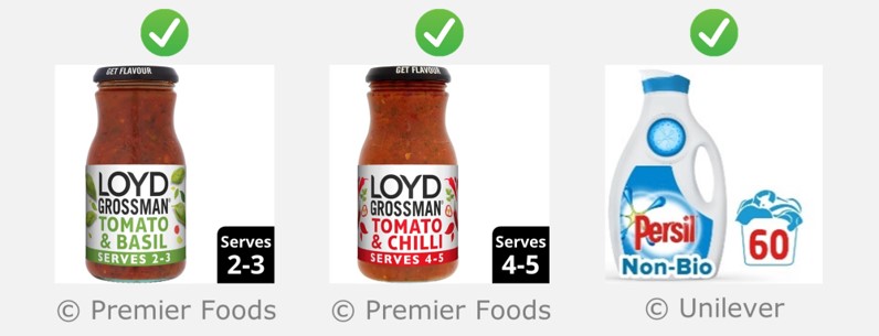
Suppliers are encouraged to describe size as a number of ‘functional uses’ where there is an agreed category standard and/or the pack contains countable items.
If size is presented as a number of functional uses, then the size in SI units should be shown in a complementary manner, as shown in this example.
Using standard shapes for size lozenges
Off-pack size lozenges should be square, with a rounded corner. Furthermore, if an additional off-pack lozenge is used to indicate the quantity of packs within a Bundle layout, then this additional lozenge should be rectangular. Other shapes should not be used off pack (except for laundry).
Laundry products should use the standard laundry basket symbol (see example on the right), if it is established in the territory. Otherwise, they should use the standard square with a rounded corner.
In order to guarantee perfect consistency in the visual appearance of off-pack size lozenges, suppliers and retailers are encouraged to produce these using automated methods.
Rationale
- Retailers demand category standard visual consistency in off-pack communications. They will not accept images where each brand uses their own off-pack icons to describe size (or any other information).
- Mobile ready hero images are not suitable for trying to establish new visual icons. They are too small and not visible enough for this purpose.
- Laundry is an exception because the laundry basket icon appeared on the front of physical laundry packs for years before appearing off-pack on Mobile Ready Hero Images.
Note
When communicating size within the digital pack, suppliers remain free to use any assets that exist on the actual front of pack.
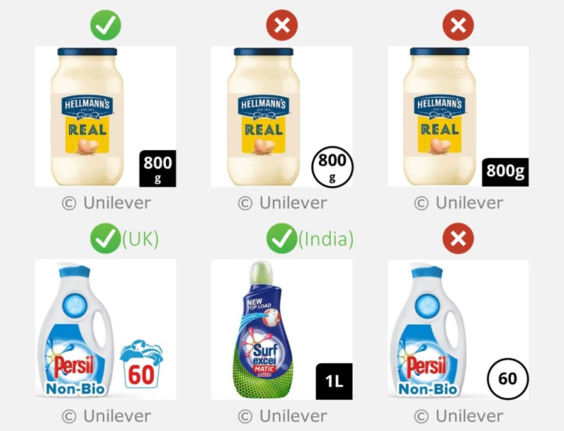
Off-pack size lozenges should be square with a rounded corner. Except for laundry, where the basket symbol should be used for size if it is established in the territory (otherwise use a square with a rounded corner).
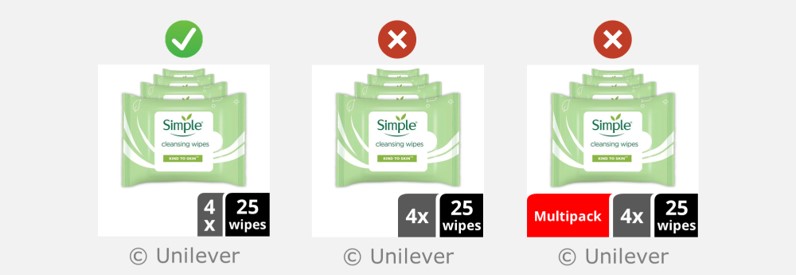
For bundle layouts, the additional lozenge that shows the number of packs should be the standard grey rectangular shape shown above. There is no need for an additional lozenge that explicitly says multipack.
Using a standard typeface within size lozenges
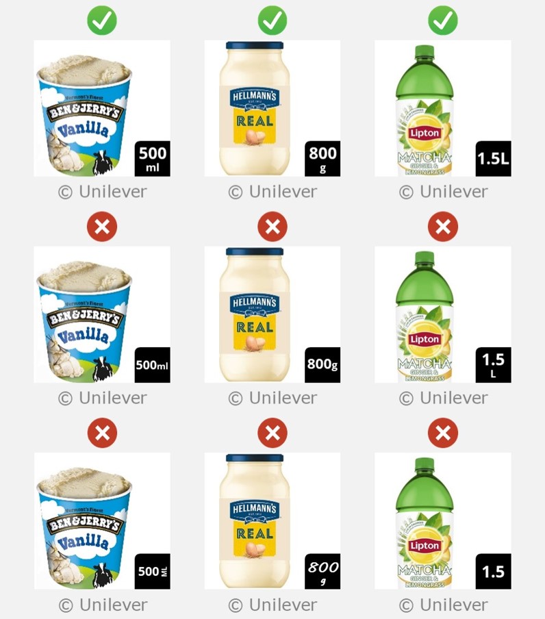
Off-pack size information should be presented in Open Sans bold.
Within a 3000 x 3000 pixel image, the font-size for the numerals should be 340px.
The text that describes the units:
- should be positioned underneath the numerals, centred and in 230 px font. An exception is litres (L) where the units should be in line with the numerals and the same size as them.
- should be lowercase. Using L for Litres is the only exception to this.
- should not be omitted.
Descriptions of functional uses should also be lowercase, e.g. 20 bags, 2 serves, 40 wipes.
In order to guarantee perfect consistency in the visual appearance of off-pack size lozenges, suppliers and retailers are encouraged to produce these using automated methods.
Rationale
This maintains visual consistency in off-pack communications, and ensures the text is large enough to pass the visual clarity test.
Off-pack size information should be presented in a consistent and standard manner.
Using standard colours within size lozenges
The colour of the size lozenge should be black. Please note that this differs from the advice in previous versions of these guidelines in which the lozenge colour matched the brand. Using black creates greater consistency between images, and all of the examples shown in the GS1 guideline use black.
The font colour should be white, as this achieves a good contrast between the text and its background.
For bundle layouts, the ‘number of packs’ lozenge should be dark grey (RGB 89,89,89).
In order to guarantee perfect consistency in the visual appearance of off-pack size lozenges, suppliers and retailers are encouraged to produce these using automated methods.

For standard layouts, the size lozenge should be black. For bundle layouts, the 'number of packs' lozenge should be dark grey.
Feedback
We would welcome your feedback on this page:
Privacy policy. If your feedback comments warrant follow-up communication, we will send you an email using the details you have provided. Feedback comments are anonymized and then stored on our file server. If you select the option to receive or contribute to the news bulletin, we will store your name and email address on our file server for the purposes of managing your subscription. You can unsubscribe and have your details deleted at any time, by using our Unsubscribe form. If you select the option to receive an activation code, we will store your name and email address on our fileserver indefinitely. This information will only be used to contact you for the specific purpose that you have indicated; it will not be shared. We use this personal information with your consent, which you can withdraw at any time.
Read more about how we use your personal data. Any e-mails that are sent or received are stored on our mail server for up to 24 months.
Unless otherwise stated, all images are © Unilever and used with permission. Walkers is a trademark owned and designed by PepsiCo and used with permission.