Mobile e-commerce is increasingly important, and shoppers tend to focus on the images on e-commerce websites, rather than the text. However, conventional pack shots fail to communicate critical information to shoppers. A clearer and more consistent alternative is needed.
Recommendations for Mobile Ready Hero Images improve consistency and prevent brand teams from engaging in an attention grabbing ‘arms race’.
On this page:
These guidelines focus on shopping on mobile devices
What is a hero image?
A Mobile Ready Hero Image (MRHI) is a representation of a real world product, which may differ from a standard pack shot, but that maintains the majority of the physical pack’s key elements of design, shape and colour. When shopping on a mobile, this ensures the hero image is recognisable as a representation of the real product.
The image should include, or be closely associated with, key information that shoppers are likely to need when making a purchase decision, or choosing the correct product from search results.
A Mobile Ready Hero Image:
- Is created specifically for e-commerce to act as the primary image in thumbnail results (e.g. in search results, favourites lists and store categories).
- Makes better use of space than a conventional packshot.
- Is designed to work well on all screen sizes that are typical for online retail (approximately 16mm tall images on mobile, 23mm on tablet and 48mm on laptop / desktop).
- Helps the online shopper to better recognise the product, and distinguish it from other similar products.
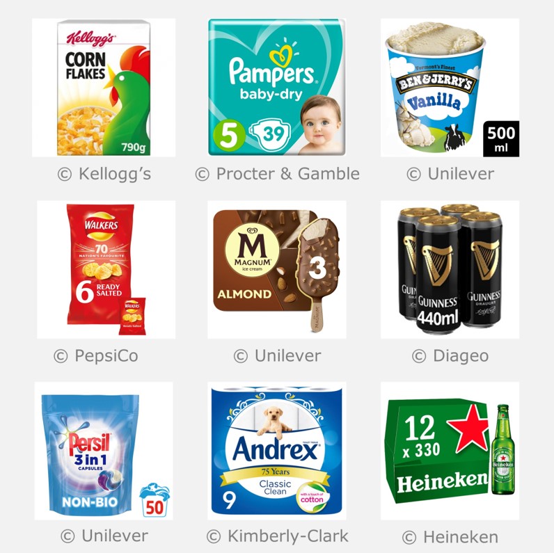
Best practice examples of hero images
Purpose of these guidelines
The objectives of these guidelines are to ensure that key information is suitably presented to users of small screens, in order to:
- Help people find the product they need more easily*;
- Increase incremental sales across the business (all platforms);
- Reduce the frequency of ‘accidental’ basket adds that were not the items the shopper thought they were*;
- Reduce brand, retailer and solution providers’ time spent designing, vetting and discussing online presentation;
- Improve the consistency of presentation;
- Increase the visual appeal of product images.
* in some circumstances, this might include staff picking items for collection or delivery.
These guidelines aim to provide a clear and structured interpretation of the GS1 guideline. We believe any image that is compliant with our guidelines will also be compliant with the GS1 guideline. However, please note these Cambridge guidelines are not endorsed by GS1 or its membership.
Scope of these guidelines
These guidelines are specifically focused on items that are bought and replenished regularly. In this situation, consumers are very familiar with the products they are buying and wish to complete their shop as fast as possible. The guidelines assume that the majority of purchases are made directly from a ‘product listing page’, which might be the result of a customer entered search, accessing a favourites list, or browsing the retailer’s menus. The guidelines have not been developed for high value or infrequently-bought items, for which a consumer is much more likely to spend significant time on the ‘product landing page’, where a single product is described in much more detail.
The guidelines were specifically developed to improve the shopping experience on mobile devices, where images in product listing pages are typically rendered at a size between 12 x 12mm and 18 x 18mm. At such a small size, most of the details within pack shots cannot be discerned. Thus, these guidelines provide strategies to enhance the image and improve the visual clarity of its critical elements. At the time of writing in June 2019, mobile commerce exceeds desktop e-commerce in most global markets, so Cambridge recommends that product images should be designed ‘mobile first’. However, the same image is likely to be shown across all devices, and the use of hero images on desktop devices usually has a positive impact as well.
Underlying principles
The principles used to develop these guidelines were as follows:
- Be clearer: Improve the visual clarity of the four key messages (4Ws) that are needed to recognise the product and distinguish it from other similar products.
- Be faster: Increase the speed of finding a particular product within a search results page by highlighting its distinguishing features.
- Be consistent: Promote consistency to improve the shopper experience. For example, if an off-pack size lozenge is added, then it is always positioned in the bottom right corner.
- Be restrained: Prevent brands from starting an attention grabbing arms race, which would be detrimental to the overall shopper experience. For example, the guidelines recommend against breaking the edges of the pack because it is too visually disruptive.
- Be square: On a global basis, nearly every retailer uses square image tiles, so we recommend that Mobile Ready Hero Images should be square.
- Be achievable: Only use technology that is compatible with the systems in use by the vast majority of retailers, on a global basis. Currently, most retailers do not display size information directly underneath the image (on mobile), hence we recommend that off-pack size lozenges should be embedded within the image that is supplied to the retailers.
Visual consistency and clarity are key considerations.
Definitions
The following terms are used throughout this website:
- Front of pack: The actual front of the physical pack.
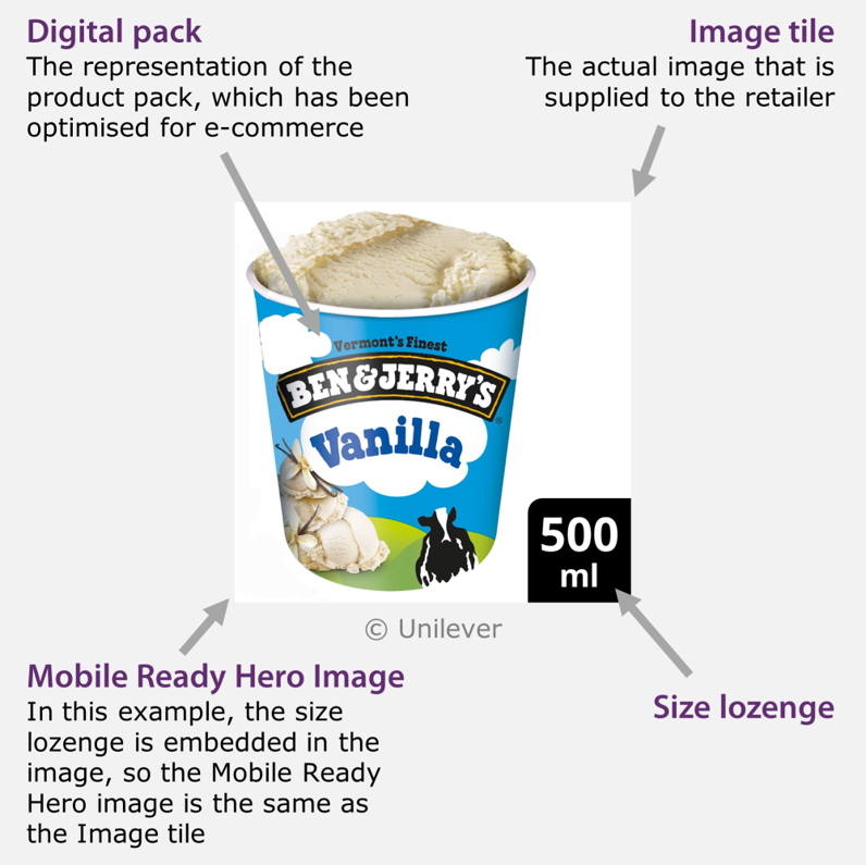
- Digital pack: The representation of the product pack, which has been optimised for e-commerce.
- Image tile: The actual image that is supplied to the retailer, including the digital pack and surrounding white space. It may also include a size lozenge in the bottom right-hand corner.
- Size lozenge: A black square that contains size information in white text, which is positioned in the bottom right-hand corner of the image tile1. Except for laundry, where the basket symbol should be used, if it is established in the territory.
- Mobile Ready Hero Image: The representation of the product that e-commerce shoppers actually see. This includes the digital pack, and may also include:
- A size lozenge within the image tile;
- Size information that is presented by the retailer and positioned directly underneath the digital pack2.
1 Bundle layouts may use a double size lozenge, where a lozenge with a grey background indicates the number of packs, and a lozenge with a black background indicates the size of each pack.
2 At the time of writing in February 2022, close to zero retailers were presenting size information directly underneath the digital pack (on mobile). However, this approach is encouraged, and hopefully this will become more common in the future.
These terms are used throughout this website.
Feedback
We would welcome your feedback on this page:
Privacy policy. If your feedback comments warrant follow-up communication, we will send you an email using the details you have provided. Feedback comments are anonymized and then stored on our file server. If you select the option to receive or contribute to the news bulletin, we will store your name and email address on our file server for the purposes of managing your subscription. You can unsubscribe and have your details deleted at any time, by using our Unsubscribe form. If you select the option to receive an activation code, we will store your name and email address on our fileserver indefinitely. This information will only be used to contact you for the specific purpose that you have indicated; it will not be shared. We use this personal information with your consent, which you can withdraw at any time.
Read more about how we use your personal data. Any e-mails that are sent or received are stored on our mail server for up to 24 months.
Unless otherwise stated, all images are © Unilever and used with permission. Walkers is a trademark owned and designed by PepsiCo and used with permission.